Search

Louise Richardson

A level Media Blog

Month

January 2017

The Purpose of Film Magazines

Film magazines are an effective way of promoting a film to a variety of audiences. The reason behind this is that are available in a variety of places such as supermarkets, shops and popular retail stores which are accessible to a variety of audiences. This as a result helps to spread the word about the film and increase its popularity. Film magazines are also an example of ‘old media’ which refers to the ways in which the promotion of film occurred before the use of digital media became more prominent. By using a magazine as a form of promotion, the audiences that still use magazines such as the older demographic and very young children, would be drawn into the film which would allow the film to reach out to a much wider demographic.

Within a film magazine there may be features such as interviews, exclusives from the film, posters and sometimes quizzes which could spark interest in audiences for very different reasons. These features all appeal to different audiences which as an effect would target and attract a mass target audience for the film.

Typical codes and conventions of horror film magazines are:

Main Image: This is usually the main focus of the magazine that features a mid or close-up shot of the character/s in the film. The image is usually shot in direct address to the reader to draw the users in to buying the magazine and finding interest in the film.

Masthead (Title): The film title is most commonly found at the very top of the magazine, central to the cover image.

Strapline: The strapline is found at the very top of the magazine, usually above the Masthead. Its purpose it advertise the product and help people to remember what is in the magazine. The Strapline promotes products within the magazine and short and punchy which encourages the readers to buy the magazine and show interest in the film.

Anchorage Text: This is conventionally found underneath the masthead and tells the readers what both the Masthead and Main image are about. This gives them an insight into what the film is about and promotes it further.

Using magazine covers as a way of promotion alongside my film poster and trailer would be very effective as it would allow me to reach another demographic audience such as the older generation. To ensure that it is completely effective I will use all of the above codes and conventions of film magazines. This will make my magazine appear professional looking and will ensure that it is definite to attact a mass target audience.

PANDEMIC: Naming our Horror Trailer

Since the very start of the production of our Horror Trailer we have pondered on what would be the most effective name to call it. We had to ensure that it gave relevant connotations to the zombie sub-genre of the film and that it was also suitable to the film’s theme.

Due to our Horror sub-genre being based around Zombie’s, gore and world alert, we needed a name that reflected danger and ‘infection’ so that it would fit the general theme that we wanted. In order to do this we searched for synoyms of words such as ‘infection’, ‘epidemic’ and ‘disease’ so that our film will sound interesting and leave the audience aware of the film but still curious about what the dilemma will be within the film.

definition-diseasedefinition-epidemic


How has our research effected our planning?


During our research stage using the theasurus website, we decided that we would only select titles with one word due to our previous research into horror films telling us that one word titles are more effective and common than any other titles.

Some examples of these successful films include:


After looking into successful films with one word titles, Melissa and I drew closer to a specific word that reinforced the facts from our research well.

The word that we chose was ‘ENDEMIC’ and its definition is as follows:

endemic-definition

We thought that this word would be most suitable to our horror trailer because it refers to the possible disease that causes the problems in the entirety of the trailer. This is important because it highlights to our audience that an endemic of a disease will occur in the film which relates back to the conventions of Zombie horror films.

We also noticed that not all audiences are aware of the meaning of this word and are must more familiar with the word ‘epidemic’ which refers to the spread of a disease across a large widespread of people. This word on the other hand refers to disease on a small scale and once the audience are aware of this they will understand the isolation in which the characters would feel within the setting which would make them more scared for them later on in the trailer.


Additional Research and drawing our final decisions


definition-pandemic

Later on in our research we also came across the word ‘Pandemic’ which we found had a similar meaning to the word epidemic. Due to us wanting to represent the disease as more widespread we decided that this word would be a better option for our horror film. With this in mind, we knew that by doing this we could incorporate news reports during the initial distruption stages of the trailer to show a variety of languages making the trailer more interesting and realistic.


Typography


After choosing the name of our film we began to look into possible typography that we could use for the title. To do this, we used a website called http://www.dafont.com/ which had a wide variety of fonts and styles that we could choose from. Throughout this process we thought that it would be best to relate our typogrpahy back to the theme of the film by focusing on fonts most associated with disease and lockdown during national disaster. We felt that this would be important in order for our audience to initially be shown what sort of film the trailer is representing.

Some of the fonts that we thought would work really well with our overall genre and theme are as follows:

We thought that the typography shown above would be the most effective choices to put into our horror trailer due to their link with the zombie horror genre. We will use the font that we choose in both our trailer and poster in order to maintain a continuity and familiarity with the audience and th

Horror Film Poster Analysis

As part of our ancillary task we are in the process of creating a film poster for our horror production therefore I decided that it would be important for me to have a more in depth understanding of film posters by analysing three current ones. I have decided to use modern horror posters because they will be most relateable to the modern target audience that I have for my film. This will mean that it will be more suitable for attracting audiences meaning the horror film will be more sucessful overall.

Whilst analysing the three film posters I decided to look closely into:

  • Title
  • Main Image
  • Tagline
  • Colours
  • Typography
  • Addtional information such as directors and actors
  • Release Date

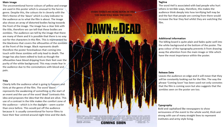
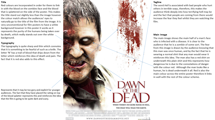
The three successful horror film posters that I have chosen to analyse are Dawn of the Dead, Deliver us from Evil and an alternative Dawn of the Dead poster.

This is my analysis of the three horror film posters that I have put onto Slideshare:

Here is the link to the webpage if the embeded SlideShare does not work:
I have also included screenshots of the powerpoint below:
poster-analysisposter-analysis-2poster-analysis-3poster-analysis-4

FILMING DAY 3


Yesterday we filmed the last main parts to our Horror Trailer. We decided to focus on the three main elements that are vital for the narrative of our trailer to be clear. Firstly, my collegue and I did some filming with Mr Green – the principle of our school – who we asked to film some shots of him making the announcement that he is going to lock down the school. We did this by doing some close-up shots/mid-shots of him rushing around his office and finding out about the spread of the disease. We then took some long-shots of him sorting out the camera to film himself talking about the disease that has spread over the world. We decided to do this in order to show the stress that Mr Green is under. We also knew that the variety of shots would enhance the narrative of the film and would allow the audience to feel like they are actually in the office with the Principle and the reality of the film. With this in mind, we took a shot of the announcement that the principle took on his camera. We did this by recording a version on the filming camera with the aid of the tripod as well as using an adavanced iPhone app called CamCorder to film a more rustic looking filming technique that would fit the Zombie Horror conventions. The fact the film that Mr Green has created is not clean cut or professional would suggest to the audience that the authority that they are relying on in the film is no longer reliable. This may cause the audience distress because they will become aware that there is no-one for the young characters to be looked after by.

We also took the opportunity to film after school yesterday. We asked our four main characters to stay behind so we could complete filming one of the jump scares, a few disorientated shots and also and few perspective shots of zombies chasing the characters. This was successful as we were able to do these shots and added a few additional shots that may also be effective for the trailer.

untitled-3

On Friday we plan to stay behind after school and do a large zombie apocalypse with a large group of students. We have two students who are prepared to put on Latex zombie makeup which will add to the realism of the trailer which will ensure the audience are more affected. Other students will have scruffy clothing and we may use some fake blood to emphasise that they are diseased and want to kill other students. We plan to film these shots on the film as we feel that the mist on the field would look really effective with the zombies walking through it. This is due to the audiences fear of the unknown. With the zombies walking through the mist, the audience wouldn’t be expecting it meaning that they would have more fear.

img_4577


Horror Trailer Test Shots

The editing process within the film industry is one of the longest parts of the film production, therefore I have decided to create a short video to showcase some of the shots we have so far that may or may not be featured in our horror trailer. Many of these shots show the environment in which the trailer will be set in and give off an eary sort of atmoshphere.

The test shot video I have created is below:

After uploading the test shot video I noticed that the video had a very low render quality and the shots were not shown how they should have been. This is something that I will learn from and will need to address when uploading the final draft of our Horror Trailer. I feel that this task is a very important part of the production stage because it has allowed us to notify what areas within the editing stage we need to improve on when editing the final video.

Horror Film Posters: 1st Draft

Before doing our official photoshop versions of our posters we decided to draw up a few drafts ideas that we have come up with in class. We have decided to craft the poster like this because we are not completely sure which colours and layouts will work when we put them onto photoshop therefore we will evaluate the effectiveness of the posters after our second drafts.

Here are our drafts below:


Draft 1


img_1653

The first draft that Melissa and I planned is shown above. We had the idea of having one of the students in our film lye on the floor showing a bite mark on their arm. An infection from the bite is shown to spread up the arm of the student all the way up to their face where half of their face is infected and the other half isn’t. It will be made clear to the audience that the student is infected in some way meaning that they may be a zombie. This feature initially shows off the genre of the film to the audience which is important for a horror poster as we have learnt from our previous research into the purpose of Horror Trailers.


Draft 2


img_1654

On our second draft we took inspiration from posters with black backrounds such as the Deliver us from Evil poster. We decided that the main image should be a long shot of a student or teacher who has been infected, standing at the end of a corridor looking directly at the camera. We will use minimal lighting to create an isolated effect and the image will have a black fade border effect so it fades into the black background. We have not decided whether we will have just one student in the image or a group of them like there is in the Dawn of the Dead poster, however after our 2nd drafts we will figure out what looks most effective and redraft from there.

The Purpose of Film Posters

Using a film poster to promote a film is one of the most successful ways to draw in a wide target audience. Film posters can be made acessible so that they can be posted on online mediums such as facebook, twitter and other networking websites. The fact that they can be put online means that they can be shared so that the films release will be familiar to all of the people it has been shown too online. Film Posters can also promote the film on large outdoor frames such as billboards and even buses. The wide variety of ways in which the film information can be accessed ensures that there is a wide range of audiences being exposed to to it, in effect, more people will want to come and see the film.

Film Posters often posess information about the film such as the release date and a little hint about the plot through a tagline. The information on the plot of the film is also hinted through the type of image that is used. For example, if a film is about a group of teenagers in highschool it would most likely show a group of teenagers in a highschool setting as the background. This is slightly similar to horror film posters however the image is usually quite secluded and often only focuses on the main thing in the film. The poster appears more scary as an effect of this technique but also leads the audience wanting more due to the lack of hints about what will happen in the film.

I have decided to write a list of the typical conventions of horror film posters:

Title: The title is usally large and one of the main features of focus on the poster. The typography of the title reflects the genre of the horror film, for example, if the film was a slasher, the typography may be sharp and thin like the cuts of a knife. The title is also placed generally in the centre of the poster in order for the audience to be clearly aware that it is the title of the fim.

Tagline: A short and snappy tagline will be usually placed underneath the title in a similar, smaller font. In order for the film to be rememberd by the audience the tagline must be clever and relatable to the theme of the film so that the audience can easily link it all together.

Main Image: The main image takes up the entirety of the poster and acts as a background to the information, titles and tagline on the rest of the poster. It is extremely important in representing the actual plot of the horror film as it gives hints about the genre of it. In Horror film posters the main image is usually very dark and obtains elements of black and red.

Release Date: All film posters show the release date of the film in order to fulfill their primary function – to get people to go and see it. This makes the release date a very important piece of information on the film poster therefore it usually takes its place at the cente bottom of the photo and usually correlates in colours with the main title to draw the audience to it also.

Name of Actor/s: It is important that the actors and actress’ gain recognition for their part in the horror film in order to draw fans of the celebrities in to watch the film.

Names of Directors and Producers: Well know producers may be put onto posters in order for the audiences to recognise how well the film is going to pan out. If the producer/director has created similar films that were successul (such as James Wan) then it is quite likely that this film wil also be good. This draws people in because they know that the production and directing elements were good.

I believe that film posters are one of the most effective ways to promote a film alongside trailers and magazine promotions. With this in mind I will be creating one to enhance the promotion of the horror film and to make the production process more sophisticated and professional. When creating my film poster I will keep in mind the important codes and conventions of typical horror film posters in order for my film to also be sucessful with a mass target audience.


FILMING DAY 2


Today we were able to sucessfully film the next few shots for our horror trailer. We were able to film a high quantity of important shots this time as we had all of the characters that would star in our horror trailer.

During the first hour of filming we spent our time filming the classroom shots. We did this because these are the main shots in our horror trailer so we needed to get these shots out of the way first. During this time we filmed the alert system shots as well as shots of the teacher and various students. We also focused on our four main actors and did a variety of individual shots and groups shots with them. We did these shots in the corridors before they go into the classroom to emphasise the time frames in which the narrative is going move.

We were quite fortunate to film our distruption shots in a classroom that was quite isolated and didn’t have any windows. This made the little light that did come through the windows appear eary which created a sense of solitude (which is a common theme in our horror trailer)

Create a website or blog at WordPress.com

Up ↑