In order to have a deeper and more insightful understanding of film magazines and how they work to promote film, I thought it would be best to analyse three very different magazine covers. This task will allow me to identify key features of film magazines that make them so effective, which in effect will make the film a success.
This close analysis has made me aware of the importance of a variety of features in film magazines and how I can manipulate them to make the most effective film magazine cover. For example, I now know that by having the masthead in all capitals and in bold, it will make the magazine seem more important and it will stand out to the audience more. I will be sure to use this feature in my film magazine cover in order for a successful outcome.
I have learnt from this research task that all film magazines obtain the following features:
The Masthead
Main Image
The Strapline
Anchoridge Text
Here is my analysis of the following film magazines:
Within our Horror Trailer we will need to include the film title, institution logo and the release date of the film, therefore it was important for me to research into existing horror trailer institutions that obtain these features and analyse what makes them so successful. I have decided to do this in order to implement these successful features into our own horror trailer. The horror trailers that I have chosen to analyse are relatively modern due to the fact that our horror trailer is related to a modern era. We want to make our horror trailer as relatable as possible for our modern target audience and this task will help us with this.
Below I have created gifs to represent what I am analysing:
Film 1 VIRAL
Institution 1: Blumhouse productions
This insititution is one of the most applicable logos to the horror genre. Its theme follows the conventional horror film genre by showing and represents clearly to the audience what sort of film they are about to watch. This institution focuses only on the horror genre and is very effective at doing so.
The name ‘Blumhouse’ links back to the paranormal sub-genre of horror that is represented in the institution logo. As I have learnt from my research, a large proportion of paranormal horrors are set within houses and the fact that they have reflected this in their institution shows the type of empty and isolated themes that they will put across within their films, therefore putting the audience on edge and building up the initial tension ready for the film.
Institution 2:Dimension Films
Dimension films is a common institution within the horror genre. Its black background keeps the dark theme going throughout the trailer and its plain graphics make the audience feel isolated. This institution is quite different to the others as it doesn’t change according to what film it is producing unlike other institutions such as Warner Bros.
The word ‘Dimension’ suggests the idea of multiple themes that will be introduced within the films they have produced. The fact that the institutions logo is 3D also reinforces this idea and links back to the institution name.
Film Title: VIRAL
The film title closely relates to the sub-genre zombie-horror that it represents. This is done through it having bacteria in the background that emerges from the darkness. This links to the theme of disease due to the connotations of death that the black filtered bacteria suggests. This is effective because it gets the audience questioning as to what the bacteria actually is and whether it will harm them. This will lead to the success of the film due to the audience being drawn in by the mystery of the trailer.
Release Date: Jan 2017
Film 2 Lights Out
Institution 1:Warner Bros
This institution is very popular within the horror genre and films associated. The original logo is often adapted for each film so that it fits the genre. In this case, the background is darker and the letters appear more faded and old making the old fashioned horror theme stand out.This technique also adds mystery to the beginning of the trailer and begins to build the vital tension within the audience as they watch the trailer.
The pace in which the institution is displayed to the audience is quite quick and a black fade in and out effect is used to do this. This makes the audience feel isolated and it begins to increase the tension that they feel due to the quick pace of the trailer.
Institution 2:New Line Cinema
New Line cinema is also a very common institution within the horror genre, however very much like Warner Bros it has made films such as:
The logo has been adapted to fade into a dark, cloudy night background which represents themes of darkness and isolation to the audience. This initially sets off the tone for the film and reinforces the audiences fears of being alone and in the dark. Also, the producers have cleverly edited the logo to look as if it is moving away from the audience into the emptiness of the night sky. This again makes the audience feel very alone creating a higher sense of fear within them in preparation for the film.
Film Title: Lights Out
The title ‘lights out’ initially strikes out at the audience due to their childhood fears of the dark. Darkness is a very conventional theme within horror films and trailers, therefore by them using it as a title this means more fear is actually created overall in the audience.
The institution name is written in ‘scratchy’ like typography as if it has been scratched onto the wall by a ghost child or person. From my research into horror genres, I know that this theme of scratchy writing is often seen in paranormal films and this tells the audience what sort of fear they are in for when they watch this film. Continually, the name of the film also links in with the light switch that is framed within the shot. The audience can clearly see that there is no-one there to turn the light switch off, however, the camera movement suggests that something is approaching, and the light switch flicks down on its own. This is quite shocking for the audience and the screen instantly changes to a black screen displaying the release date of the film. The mystery that is created from this editing overall draws the audience in, making them want to see who the villain actually is.
Release Date: Aug 2016
Film 3 The Woman In Black
Institution 1:CBS films
This institution logo has been adapted from its original plain form to fit the paranormal genre of this film trailer. In the background we can see dust and smoke which suggests old age and mystery to the audience. This is a common theme in the horror genre and the fact that they have used dust around the institution logo, it represents the theme of an abandoned house that is used in the film The Woman In Black.
Institution 2:Cross Creek Pictures
Very much like the previous institution in this horror trailer, the logo is surrounded by darkness, dust and smoke which are all conventional themes of the genre. This institution links closely to the windows of the manor house that are feautured in the film which makes the shot look eerie and isolated. This is important for setting the tone of the film with the audience.
The name ‘cross creek’ works well in the horror genre because due to its connotations with death. Cross creek suggests a dangerous river creek that could lead to a serious accident. This fits well with the horror genre because of its themes of death and danger. The word ‘creek’ also brings about connotations of creeking floorboards and doors that create tension in the audience. This also links in with the creepy house that is used in the film and the many creeks that are heard around it at night to create fear.
Film Title: The Woman In Black
This film title cleverly reflects all of themes that will be featured in the film. The writing is wiped onto the condensated window as if a ghost has written it and this automatically tells the audience that the trailer has paranormal themes. This idea is reinforced as a black vale flickers across the screen. The fact the film is called the woman in black shows that this could be her and this creates tension and mystery in the audience as the do not know who or what she is as she gets closer to the screen.
The fact that the title is written onto a window represents where the film will be set, which in this case is in an abandoned house. From previous research I know that this setting is a very conventional place for a horror film to be set.
Fades are used throughout the entirety of the film trailer which adds a sense of mystery to the trailer.
Film magazines are an effective way of promoting a film to a variety of audiences. The reason behind this is that are available in a variety of places such as supermarkets, shops and popular retail stores which are accessible to a variety of audiences. This as a result helps to spread the word about the film and increase its popularity. Film magazines are also an example of ‘old media’ which refers to the ways in which the promotion of film occurred before the use of digital media became more prominent. By using a magazine as a form of promotion, the audiences that still use magazines such as the older demographic and very young children, would be drawn into the film which would allow the film to reach out to a much wider demographic.
Within a film magazine there may be features such as interviews, exclusives from the film, posters and sometimes quizzes which could spark interest in audiences for very different reasons. These features all appeal to different audiences which as an effect would target and attract a mass target audience for the film.
Typical codes and conventions of horror film magazines are:
Main Image: This is usually the main focus of the magazine that features a mid or close-up shot of the character/s in the film. The image is usually shot in direct address to the reader to draw the users in to buying the magazine and finding interest in the film.
Masthead (Title):The film title is most commonly found at the very top of the magazine, central to the cover image.
Strapline: The strapline is found at the very top of the magazine, usually above the Masthead. Its purpose it advertise the product and help people to remember what is in the magazine. The Strapline promotes products within the magazine and short and punchy which encourages the readers to buy the magazine and show interest in the film.
Anchorage Text: This is conventionally found underneath the masthead and tells the readers what both the Masthead and Main image are about. This gives them an insight into what the film is about and promotes it further.
Using magazine covers as a way of promotion alongside my film poster and trailer would be very effective as it would allow me to reach another demographic audience such as the older generation. To ensure that it is completely effective I will use all of the above codes and conventions of film magazines. This will make my magazine appear professional looking and will ensure that it is definite to attact a mass target audience.
As part of our ancillary task we are in the process of creating a film poster for our horror production therefore I decided that it would be important for me to have a more in depth understanding of film posters by analysing three current ones. I have decided to use modern horror posters because they will be most relateable to the modern target audience that I have for my film. This will mean that it will be more suitable for attracting audiences meaning the horror film will be more sucessful overall.
Whilst analysing the three film posters I decided to look closely into:
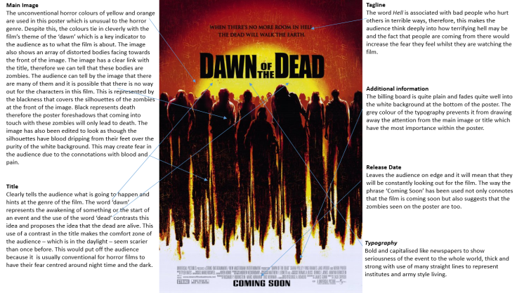
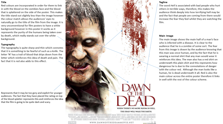
Title
Main Image
Tagline
Colours
Typography
Addtional information such as directors and actors
Release Date
The three successful horror film posters that I have chosen to analyse are Dawn of the Dead, Deliver us from Evil and an alternative Dawn of the Dead poster.
This is my analysis of the three horror film posters that I have put onto Slideshare:
After collecting the results from my questionnaire, I am going to use the data to put into graphs that I can analyse. The graphs will give me an insight into what elements of other horror trailers I should use in my horror trailer for a successful approach.
Question 1 What is your gender?
For this task, I ensured that I had the same amount of male and female participants to balance my results out. Males and females may have very contrasting views therefore to avoid bias I had 50% male contribution and 50% female contribution.
This question will allow me to see what will attract both a male and a female audience with my horror trailer which is important in order to attract a mass target audience.
Question 2What age group do you fit into?
A large proportion of the people I asked were aged 16 -21. I did this because this is the target audience that my horror trailer will be mostly aimed at. By aiming a survey at them, I will have a better insight into what will be most effective for them to watch.
Question 3What is your favourite Horror Film Trailer?
The results above show that there is a signicant popularity for both The Conjuring(2016) and Scream() between our participants. Whereas Scream falls into the sub-genre of teen-slasher, The Conjuring is a psycological/ paranormal horror which are both quite contrasting. Despite this, this could suggest that our audience like both paranormal themes and blood and gore that are caused by spirits. This could be a possible idea for our own trailer by using these sub-genres.
Question 4What is your favourite horror sub-genre to watch?
The results from this question have shown that Paranormal and Psychological Thrillers are the most popular sub-genres between the audience that answered my questionnaire. This supports the previous question and tells me that paranormal and psychological themes would be best to use in my own trailer to attract the young audience that I want to successfully.
Question 5What do you feel is the most important convention to have in a horror trailer?
The results of question 5 show that my audience felt that Jump Scares, Creepy Music and Isolated settings are the most important conventions of horror trailers. I will incorporate these ideas into my horror trailer to have the most effect on my audience. Continually, due to Jump Scares having the highest score of 6, I will ensure that my jump scare is very clear at the end of my trailer and small build up of small jump scares builds up to it for the scariest effect.
Question 6What sort of pace/speed do you think a horror trailer should move at?
The results above show that my audience find a medium paced horror trailer most suitable. The fast paced horror trailer option was also quite popular, therefore I am going to use a mixture of all three to show contrast throughout the trailer and make the fast paced sections more shocking.
Question 7What types of sounds do you find most creepy or effective in a horror trailer?
It is very clear that my audience found that eerie background music was most ‘creepy’ for horror trailers. Due to the popularity of this option, I will use eerie music successfully in my own horror trailer. I feel that this was the most popular option because it sets the atmosphere for the entire horror trailer.
Question 8What particular lighting would you expect to see in a horror trailer?
My audience has shown that they usually expect to see a mixture of low-lighting, high-lighting and no lighting in horror trailers. Due to their keen intrest into a mixture of both no-lighting and low-lighting, I will use both to set the atmosphere of the trailer throughout. These results could suggest that by having a sense of fear all the way through the trailer due to darkness, the scariest parts are even scarier than they would have been in high lighting.
Question 9Where do you feel is the most typical and effective setting for a horror trailer to be set?
My audience have shown a clear interest in abandoned house and building settings. Depending on what facilities are available to me, I will definitely consider using an abandoned area for my horror trailer.
Question 10Where would you usually expect the title of the film to appear in a horror trailer?
There was quite an even perspective on where the title of the horror film should go on the trailer. The most popular place that my audience thought would be best for the title was the end of the trailer. I will use this data to put my horror title at the end of the trailer.
I feel that this shows that putting my title at the end will help the audience to remember the film even more because it will be the last thing they see.
Question 11What sort of narratives pull you in when watching horror trailers?
These results show that the most popular horror narratives for my audince are murderers and diseases. I believe that my audience very much fear the idea of isolation with something tring to catch them that they must get away from. I will use this idea in my own horror trailer to draw my auidence in.
It is important that I have a clear insight into my audiences likes and dislikes in order to make the most effective horror trailer for my target audience. Therefore, I have created a questionnaire that will allow me to understand what my audience find most appealing about trailers within the horror genre and what draws them in most.
I will be aiming my questionnaire to a wider demographic (from 16-60+), other than just teenagers in order to enhance my knowledge of what a wider audience would like. This would mean that my horror trailer would be more likely to be successful overall because a wider audience would want to see it. With this in mind, I had to ensure that the questions I asked were relevent to the horror genre and all of the audiences that I asked in order for the results to be relevent and reliable.
The questionnaire I created was distributed to 12 participants, in which 6 were male and 6 were female. I decided to do this to make the comparison of the results easier and more balanced to prevent the results being biased.
All of the questions I have used are closed questions which will produce quantitative data. This data is numerically counted and is easier to collect and interperet to come to conclusions, therefore, with this in mind I felt that this method would be most suitable for me. With this data I will collate the results into graphs that will show me the most popular answers and from this I will analyse the results to come to a conclusion about what strategies would meet my target audiences wants for my own horror trailer.
After exploring how popular horror trailers have used certain techniques to make their film succesful and how non-popular trailers have not, I have gained an insight into how I should create my own trailer successfully too. With this in mind, I decided to create a presentation to demonstrate my knowledge of what to do and what to not do if you want a successful horror trailer.
This task has really helped me to develop my knowledge for the creation of the main task as I now have a a clear focus on what specific stragies I will need to use in my own trailer.
The success of a horror trailer is determined by a variety of factors: Camera, Sound, Editing, Mis-en-scene and conventions. In order to understand how these factors can be used successfully to create a high quality horror product I decided to analyse four different existing horror trailers to see what they have done to draw their audience in. This will help me to apply to my own trailer what successful horror institutions have done to make their trailers so applicable and popular to a wide target audience.
I am going to be analysing the following points:
Camera
Sound
Mis-en-scene
Editing
Conventions
In order to contrast and compare a variety of horror trailers effectively, I have chosen to analyse two old film trailers and two recent films that have been released in the last few years.
Lights Out (2016)
The first horror trailer that I have chosen to analyse was made for a film that was released in 2016. Lights Out(2016) is a popular supernatural horror film and was created due to the success of a previous short film created around the theme.
This is the Official Lights Out film trailer:
Camera, shots, angles and movements
At the very beginning of the trailer an establishing shot of a textile warehouse is shown. There are lights around it making it seem as though the scene has equillibrium. Despite this, the lights create many eary shadows and due to the scene being set at night these two factors both complement the idea of something being ‘wrong’ or something is lurking in the shadows. The next shot then goes on to introduce the audience to the inside of the warehouse and shows a variety of broken mannequins that seem to not have been used in a long time. This disorted image shows the audience that the warehouse is empty and something is going to happen.
A shot from behind the victim shows her walking into the darkeness of the warhouse which again highlights the isolation of the scene and also reinforces the audiences childhood fear of the darkness. Why is that woman walking into the darkness on her own?
Our fist sight of the villain is viewed from an over the shoulder shot of the victim. The full length of the villain can be seen however they are disguised by the darkness. This shot suggests that antagonist is going to unexpectively creep up on the victim when they are least expecting it.
A close-up shot shows the main character of the film and represents her fear and acknowledgement of distruption as the young boy tells her that he has saw the villain. The fact that the shot shows her higher up over the young boy represents her authority and responsiblity over him which makes the audience fear more for her as they have already saw the antagonist.
The fast movement upwards of the camera acts as a form of a jump scare to the audience. They assume that the villain is weak at the start of the shot and it sends them into shock when they discover that the antagnoist is definitely not weak.
This low angle shot of the villain represents it as superior to the victim because it is now aware that it holds fear over her. The victim seems vunerable and defensless and is therefore seen from lower down on the floor in the over the shoulder shot.
Sound
Non-diegetic: this ‘real’ sound adds to the realism of the trailer during dramatic scenes, for example, during the warehouse scene the sounds of footsteps and light switches are heard. These sounds draw people in as they are often heard through the silence which makes the trailer generally more creepy and effective.
Mise-en-scene
Use of lighting:At the start of the trailer the use of lighting is used to its full advantage. Low lighting is constantly used to represent the constant presense of the villain which keeps the audience on the edge of their seats whilst watching it. The low-lighting within both the warehouse and the house also create many shadows, which makes the audience question whether there is anyone or anything lurking within them. The use of this kind of lighting fits well with the theme of ‘lights out’ as it focuses on the evolutionary childhood fear of the dark.
Later on in the trailer LED lights are used to further emphasise the theme of the dark. Bright red flickering lighting is used to not only to show the disortion of what the character is feeling, but also to further imply the extreme danger that the victim should be avoiding. The colour red signifies danger, blood, and death, and therefore the fact that this colour has been used as the only sorce of protection for the victim it clearly implies that she cannot escape at all and has to face the empending darkness that awaits her.
Setting/props: The use of the manequines in this trailer is extremely effective because it foreshadows that the villain is similar to the dummies. Throughout the trailer, we do not get to see the villains face and it is simply a shadow. This is very much like the disorted and broken mannequins that are all scattered around the warehouse. This is extremely creepy and suggests that the villain could be anywhere at anytime and could be lurking in any corner.
Editing
At the beginning of the film match on action shots are used between the young boy and older woman who are having a conversation about the villain. This type of shot represents that they have a connection to one another due to the shots being so close up and personal. This helps the narrative run smoothly and also adds tension for the audience because they now know that the woman is responsible for the young child and will need to protect him as well as herself
A significant amount of fast paced editing is used near to the end of the trailer and this stategy effectively reflects the extreme emotion of the characters. For example, at the beginning they are calm and have equillibrium, however once they start to investigate and experience what is going on with the villain they are distrupted and the editing gets quicker to show their panic and distress because of how much they fear the villain.
Jump scares are also used in this horror trailer when the villain jumps out on the victims and vanishes due to the light being switched on.
Conventions
Within this horror trailer the final girl theory that was proposed by… has been shown. The typical blonde, blue eyed girl is the last girl to die or experience the villain in the trailer which represents females as stronger and more independent as the rest of the characters in the film
The typical character conventions are followed in this horror trailer. For example, the main female character with blonde hair can be seen as both the princess, protagonist and hero, whilst the evil spirit is the antagonist.
The convention of the horror institutions being shown at the start is also followed in this horror trailer which is effective for setting the tone of the film straight away.
Insidious(2013)
Insidious is a supernatural/paranormal based horror film that focuses on the story of a family who are being haunted by a variety of ghosts. They discover that their young son, who is in a coma, is drawing these ghosts in and they must only get their son back by searching for him in an alternate world.
This is the Insidious trailer that I will be analysing:
Camera, shots, angles and movements
Dolly: Zooms into one of the main characters whilst switching to other scenes. This draws the audience in and makes them feel even more uncomfortable as they approach the main character. The audience are made aware of what is wrong due to the cross cutting to distrupted scenes between full length of the dolly shot. This technique suggests that these shots are what the man has experienced and what he has seen is uncomfortable and distressing due to how extremely close up the shot takes us to his face. During this dolly shot, we see a mid-shot, and mid-shot/close-up and an extreme close-up, which all gradully make the audience feel more and more uncomfortble which as we are aware is the purpose of the horror trailers.
Establishing Shot:
Once again an establishing shot of the setting is shown near to the start of the horror trailer to set the scene. The shot is quite wide, and could represent how the neighbourhood seems fairly ‘normal’ and at a state of equillibrium.Despite this, the dark shadows that are created by the surrounded trees create lines in front of the house, which could possibly suggests that this families home is a prision and they have no way out due to the darkness that it surrounding their home. This is supported by the movement of the camera due to its movement around the house whilst this shot is taken. This type of shot reinforces the idea of isolation and being trapped in your own home which is relatable to the audences lives and could mean that they would believe that this could happen to them in real life.
Over the shoulder shot/high angle shot:
A shot from behind the victim who is looking at the baby monitor is shown near to the middle of the trailer in which she hears strange noises coming from it. This shot represents how something could be creeping up on her from behind, making the scene seem more eary. The shot then quickly flips using the 180 degree rule and shows a high angle shot over the woman with the baby monitor focused out of the shot. This shot emphasises the womans fear of the thing on the other side of the baby monitor and it also makes her seem significantly inferorior to the villian. Not only does the angle make her seem less powerful than the antagonist but the framing of the shot makes the baby monitor seem physically bigger than it actually is, which could suggest that the characters are in for sudden terror that they were not expecting.
Sound
Repeated sound/Sound bridge:
At the start of the trailer a metronome is set off that creates a constant ticking sound. This initially sets the pace for the trailer and triggers a sense of tension in the audience because the sound acts as a build up. The sound is bridged between scenes and gets louder or quieter depending on what type of scene it is.
Ambient Sound: at the very beginning of the trailer the sound of the wood fire burning can be heard in the background over the ticking of the metronome. This background sound suggests realism and also the idea of the demons who the man are about to experience are beginning to burn through.
Non-diegetic dialouge: the sounds that are heard through the baby monitor are disorted shouts of the spirits in the house that have been created by getting an actor to make the sounds and then edit them and disort them to make them sound inhuman.
Mise-en-scene
Low lighting:
Throughout the horror trailer low lighting is constantly used to create shadows and add to the notion of isolation. This low lighting creates an eary atmosphere around the house and suggests to the audience that the spirits haunting this family are everywhere; they could be hiding in every corner.
Clock:
The use of the old fashioned clock in the centre of the house represents the lack of time that the family have before they are taken by the spirits. This is forshadowed by the previous use of the metronome that also creates a ticking sound. Both of these props make a similar sound which shows the idea of the spirits constant scratching of the demons on the back of the families knecks.This becomes quite creepy to the audience and draws them in. Many of them have ticking clocks at home
Props: many childhood props such as the rocking horse are used to represent the supernatural theme. The rocking horse acts as a signifier to show that something is wrong with the children.
Editing
Title editing: the title at the beggining of the trailer appears disorted as the electronically produced words appear to flicker on and off the screen. This could reflect how th villain will appear to the characters and audience- by appearing and dissappearing and creating sudden panick in the victims.
Grayscale on clips: a grayscale tone is present on the clips to make the setting appear ‘dead-like’ and drained of life and colour, which further emphasises the constant presense of the evil characters.
Eyeline Match: Eyeline match is used to cross between shots of the innocent victim and perspective shots of what they see. This is a significant technique because it represents to the audience not only how vunerable the character is but also how terrifying it must be in that situation. This editing stategy makes the audience feel like they are part of this families experience which makes them want to see more of the overall film to disocover what happened to them.
Fades: many fades are used between the clips that fade to black before going to the next scene. This reinforces an idea of darkness and the speed of the trailer at the start. At first, it is relevently quite calm and so fades are used, however later on when the distuption occurs no fades are present a clips are cut to one nother instantly, causing shock an panic to occur in the audience.
Conventions
Villains: the supernatural genre often makes use of religious themes and demonic figures as villians and insidious has followed this convention. By creating a variety of villians that are all quite different they effectively reflect different levels of fear in the audience. For example, one villain is a small boy who runs around the house and torments the family – he represents the idea of the ghosts never running way. Another villian we see in the trailer is the demon standing in the corner of the boys room. This is also a common villian in this genre and provides fear in the audience because they are aware that is not human and could do absolutely anything to hurt the family.
Children: in this trailer many children are shown in the house and this is significantly creepy because the audience assume that they are innocent and should be protected however the juxtaposition of this not being true throws them off and makes them feel vunerable in the real-world. This draws them and makes them want to know more because it is so abnormal for the children to be the ones causing fear as appose to an adult or a ‘Monster’.
Setting: typically, horror movies are set in a ‘normal’ house that the family or couple have just moved into. This is exactly what insidious have done and this as an effect has made the audience aware that this could happen in their own home which adds tension whilst they are watching the trailer and makes them want to know even more.
Scream 2
Scream 2 os the prequel to the orignal 19– version of the film. Following the same storyline of characters, it shows the return of scream to the terror of the teenagers in the local high school.
Here is the trailer that I have analysed for Scream 2:
Camera, shots, angles and movements
The opening shot initally shows a canted angle close-up of the scream mask displays. This initially sets the tone of the film and reflects that the terror is going to start straight away. The fact that it is also at a disorted angle also foreshadows that distruption is going to occur at this setting straight away which builds up the attention of the viewers at first sight and pulls them in without hesitation.
Wide Mid-shots of the first people we see show them in a cinema that is seen to be quite rowdy and full of teenagers in dark black clothing just like the min villain. This implies that the villian is back and could be anywhere. The fact that all of the teenagers are framed into the shot at static level also shows the mass of people in danger from this killer and how they all have just as much chance as one another.
The first shot that we fully see a character is the first jump shot. This implies the killer’s fast faced killing spree and that he is unstopabble because of how discretely he works. In the shot there is a focus pull onto the wwho is being stabbed. This is done to show that despite all of the teenagers around them, the woman isolated from them completely making the audience fear the killer more because he is able to kill even in a public place.
Tracking: a fast paced tracking shot using a dolly is used to show how panicked the characters are when they are talking about the killer. The shot frantically turns the corner as the characters do which shows their lack of control over the situation which makes the audience feel extreme stress and fear for them.
The main female character is shown in a static mid-shot as she reacts to the phone this sis framed perfectly to show the darkness behind her, which foreshadows the darkeness of the killer soon creeping up on her. The next shot is also a mid-shot but gradually zooms closer to her face. This shot reflects the isolation that she feels and the idea that she is the most important victim because of how close the audience get to her face.
Focus pull: as the camera zooms in on the girl holding the phone the flowers behind her go out of focus and blend into the background whilst her facial expression of fear becomes more prominent. Thisreflects that she is getting further and further away from youth(the flowers) and closer to the darkness of death.
Sound
Screams: not only does this diegetic sound reflect the theme of the film but it obviously implies how tragic the evens that are going to occur will be. As the trailer goes on the screams become more and more promiment and distraught making the trailer seem more dramatic and terrifying overall.
Ringing: each time the phone rings, silence often surrounds it which represents it as a signifier for the killer being close.
Stabbing sound: jump scares are often accompanied by the sound of the killers knife stabbing someone. An example of this is at the very start of the trailer where the first victim is taken. This signifies the audience when distruption is about to occur because of how isolated the victims are.
Mise-en-scene
High-school: usually, high schools are seen as safe public environments, therefore by setting it there it reflects how discrete and sudden the killings will be. The audience as a result are shocked more easily due to the unpredictable nature of the villian.
Flowers: during both phone calls with the villin the girls are stood infront of or at the side of flowers that are often out of focus. The flowers represent their feminity and delicate nature, as well as their lack of power over the villian. By them being faded out, this suggests that they are close to death and moving further way from their youh as they speak to the antagonist on the phone.
Clothing choice: many of the characters who are being victimised wear light feminine colours such as white or pink to suggest innocence or vunerablility (like a damsel in distress) or wear red to signify the danger that is ahead of them.
House: Once again, the use of an isolated house is used to represent the idea of the comfort of our own homes no longer being safe.
Lighting:at the start of the trailer the lighting is very dim and at night which is when the first killing occurs. The light then returns to day and windows of light can be seen to the audience to represent the charcter’s equillibrium, after this point the ligh gradually gets darker due to the distuption of the killer. This is done to show that the brutal killing happens when you are least expecting it and you are in the dark and vunerableto anything, which further makes the udience believe that this could happen to them in real life.
Editing
Fades: Quick fades are put into the trailer at the beginning to show the progression of time, and this could reflect how close the victims are running out of time before the villian takes their life.
Fast paced editing: between scenes of the characters talking about the villian, fast paced back and white shots are shown of the victims’ deaths. As they are repeated or more appear, the editing on them gets faster which suggests the extreme terror tht the villian brings on the victims. The editing is also too fast for the audience to fully see what went on which makes them want to watch the film to see wht happened in full. This is also supported by the black and white editied clips that suggest that the killings that the audience are viewing happened in the past. This makes the audience feel connected to vticitims because they have looked back on their deaths. This gives them an obigation to continue watching.
Conventions
Propps charcter theory: the use of young attractive teenagers is a typical horror trailer convention. They re represneted as the damsels in distress whilst the villian is male, and there are male sheriff’s and students ttempting to figure this out. This is done to make the women feel even more vunerable when they are being attacked because they are represented as weak and therefore act weak as a result.
News Report: In typical horror movies, news reports are used to notify the victims of what has hppened which initally sets off their path to death. The news report is flickers and is a disorted image which notifies the audience that this is the distuption that will cause harm to the victims.
The primary purpose of a film trailer is to promote its product to audiences before the film is released. The trailer is used in order to engage the audience, which gets them to not only ask questions about the film leaving them wanting to know more, but also suggests to the audience whether or not they will enjoy the film. It is very important for trailers to draw audiences in using typical horror conventions and it is therefore significant to be aware that the trailer must entise the target audience in ways that they will feel ‘connected’ to the film.
Originally, film trailers were used to show the best elements of the film in order to sell it to an audience. In order to do this, the trailer for the film was originally played before the film began in the cinema to show it off as a whole at its best.In the contrary to, modern society’s use of internet platforms such as YouTube, Facebook, Twitter and Instagram have adapted the purpose of film trailers. Now film trailers have a large focus on what will engage the audience and make them want to talk about it, share it with their friends on social media and get involved. Today, film trailers are used as a way of judging whether a film is good or not and is what people use to determine whether they see the full product as a result. The use of the internet has increased the popularity and accessiblity of films to larger demographics which has meant that films trailers must appeal to a wide audience.
Modern conventions of trailers involve:
Typical conventions and codesof the genre that is being used (Jump Scares and fast paced editing after distruption for horror).
A narrative – clips are put in chronological order at the beginning in order for the audience to understand what is going on.
Graphic captions and titles – institution logos are usually found at the start, film titles come at the end, and film reviews either do not appear on the film or are scattered throughout.
Non-diegetic sound/music – reflects the atmosphere of the film and the change in the narrative as the story progresses.
Close-ups– shows main characters that are significant to the films storyline.
Establishing Shot– often shows where the film is mainly set. The weather usually determines the atmosphere of each scene.


 New Line cinema is also a very common institution within the horror genre, however very much like Warner Bros it has made films such as: